Saturday, November 6, 2010

Housing Overhang + Negative equity = total home value losses

[mEDITate-OR:
not see how much we have lost ground...
(no pun intended)

The 1st graph is designed to show U.S. how bad the shadow housing overhang really is.
The 2nd chart shows U.S. the wide variance in estimates of what the real size of the shadow/overhang and negative equity is.

The 2rd graph is designed to show U.S. how constricted we now are.
While some parts of Cal, Nev, Fla & AZ have lost 50 to even 60% of their value, the squeeze is all over U.S.
---------------
inventory of delinquent properties
--------------
negative equity deutsche bank units five estimates
----------
property house-value-debt-equity jpeg
===========
=========

Street Sweep: Fannie-Freddie tab hits $153 billion = Fannie Mae posted a $1.3 billion third-quarter loss + Freddie Mac lost $2.5 billion in the third quarter = S&P sees $700 billion housing-fix tab

[mEDITate-OR:
follow this weeks losses and stories about FMae&FMac...

Oddly, what is not reported is that the interest income PAID to the Fed govt on the ownership interest we bought for U.S..., is larger than the funds that we paid for that interest.
No, we are NOT making a lot of money.
Yes, they are both still loosing money.
But, what we paid for them IS being "covered".

The problem is, however, that ALL of the recent mortgages in RE are being severely impacted.

Remember, while FMae&FMac did make some subprime RE loans - late in the peak period.
MOST of those subprime and ARM loans were NOT made by them, but by the Wall Street investment banks - in the sand states = Cal, Nev, Fla & AZ.

And, due to the accounting rule changes, made for the big bailed out banks, nobody has fully written down the RE mortgage losses. Not yet.

Other articles document the non-agency RE loan foreclosure problems, and suggest that while FMae&FMac are bleeding, so are the other RE subprime lenders.

Thanks to Colin Barr for these very informative articles.
Must reads !!!
----------
===========
Street Sweep
Following the money in banking, economics and Washington
------------
Fannie-Freddie tab hits $153 billion
Fannie Mae posted a $1.3 billion third-quarter loss
blaming high unemployment and falling house prices for the latest rise in loan defaults.
http://finance.fortune.cnn.com/2010/11/05/fannie-freddie-tab-hits-153-billion/
----------------
Freddie shares its foreclosure fears
The foreclosure follies are turning into quite a headache for Freddie Mac
the taxpayer-owned mortgage investor.
http://finance.fortune.cnn.com/2010/11/03/freddie-shares-its-foreclosure-fears/
--------------
Freddie Mac sees no housing recovery soon
Freddie Mac lost $2.5 billion in the third quarter
and said it will be a "considerable time" before the housing market recovers.
http://finance.fortune.cnn.com/2010/11/03/freddie-mac-sees-no-housing-recovery-soon/
-----------
S&P sees $700 billion housing-fix tab
The bill for fixing the broken-down U.S. mortgage system
could approach $700 billion, Standard & Poor's said Thursday.
http://finance.fortune.cnn.com/2010/11/04/sp-sees-700-billion-housing-fix-tab/
==========

Worse than last year. But better than last month. = King County home sales higher than last month

[mEDITate-OR:
not see that all RE is local...
Well..., wasn't that obvious.

While PUG-get Sound got hit very late by the RE crisis, it is now one of the more volatile areas.
What is occurring in Phoenix is also happening in Seattle.
Central city homes are not loosing as much value as suburban homes are.
However, since most condos are near the central city, and bcuz there is no financing available, condo prices are still tanking.
---------

---------
----------

=========
Worse than last year. But better than last month.
King County home sales higher than last month
http://seattletimes.nwsource.com/html/businesstechnology/2013346026_homesales05.html
=========

Cost of health care

[mEDITate-OR:
miss out on the BLS charts of the week...

The 1st chart shows U.S. the dramatic increase in the cost of health care over W's term in office. It has doubled.

The 2nd chart in interesting, bcuz it shows U.S. that younger men & women are more closely paid the same wages. Is that bcuz the older folks were primarily men, and that when women entered the work force they started off being paid less and never have caught up? If not, what is the explanation.

The 3rd & 4th charts are also very interesting.
The 3rd shows U.S. how different parts of the country are effected somewhat differently - with the West/Pacific Coast being the hardest hit.
The 4th shows U.S. the volatility in new UI jobless claims.
Note how much improved the East North Central is compared with the West/Pacific Coast.
Out West we not only had the highest UI rate, but we are still getting hammered - double any other area.
-----------

Health benefit costs, dollars per hour worked, private industry, March 1999–March 2009
--------
Median usual weekly earnings of full-time wage and salary workers by age and sex, third quarter 2010
---------
Unemployment rate by geographic region and division, September 2009 and September 2010, seasonally adjusted
--------
Initial claimants for unemployment insurance, by census region and division, not seasonally adjusted, September 2009 & September 2010

===========
The Editor's Desk - this week
http://www.bls.gov/opub/update.htm
============

Yes, a Recovery Did Begin + Comparing Recoveries: Job Changes

[mEDITate-OR:
not SEE them lie..., with statistics...

What both of these NYTimes stories and charts show U.S. is a similar, but different, view of how we ARE making progress..., but hit a severe bump in the road - to recovery.

David Leonhardt's point is that it really IS getting better, but now more slowly.
Catherine's point is that this is much deeper and longer than prior recessions.
--------------

------------
DESCRIPTION
===========
Yes, a Recovery Did Begin
http://economix.blogs.nytimes.com/2010/11/05/yes-a-recovery-did-begin/
------------
Comparing Recoveries: Job Changes
http://economix.blogs.nytimes.com/2010/11/05/comparing-recoveries-job-changes/
==========

U.S. Economy Finally Adds Jobs in October, but Unemployment Rate Still 9.6%

[mEDITate-OR:
miss out on Daniel's unique charts...

The 1st graph shows U.S. the dramatic impact of the EURO crisis on our jobs.
The froze and we hiccuped.
The next chart shows U.S. that things are also shifting - some areas up, some down.

The 2nd graph shows U.S. that while this month those under 5 weeks many have gone down; BUT all other lengths are still going up. For the long term unemployed this is not good.

The 3rd graph shows U.S. the size of the "discouraged" work force - they are NOT counted as unemployed, but they ARE still out there - watching U.S., for their chance for a job.

The last graph shows U.S. how "seasonal adjustments" smooth out the volatility.
----------
unempl 2010-10 private.png
-----------
unempl 2010-10 sector.png
----------
unempl 2010-10 duration.png
----------
unempl 2010-10 discouraged.png
----------
unempl 2010-10 seasonality.png
============
U.S. Economy Finally Adds Jobs in October
but Unemployment Rate Still 9.6%
http://www.theatlantic.com/business/archive/2010/11/us-economy-finally-adds-jobs-in-october-but-unemployment-rate-still-96/66169/
===========

Jobs Data Highlights the Challenges for Washington

[mEDITate-OR:
forget that tis people we are talking about out there...

The first chart is from NYTimes, and shows U.S. the differences.
the 2nd chart is from AP - which almost every month show U.S. this same spread.

What is also very interesting is that not only are the UI rates for hispanics high, but they were the 1st to be let go and they are the first ones to be re-hired. Let go bcuz they were our construction workers; re-hired bcuz they will work for less money.

Not nice, but what is.
------------

========

UNEMPLOYMENT RATE BY GROUP:
(Numbers in percentages)
White: 8.8
Black: 15.7
Hispanic: 12.6
Asian: 7.1
Adult men: 9.7
Adult women: 8.1
Teenagers: 27.1
20-24 years old: 15.2
25-54 years old: 8.5
55 and over: 7.3
No high school diploma: 15.3
High school graduates: 10.1
Some college: 8.5
College graduates: 4.7
DURATION OF UNEMPLOYMENT
Average length (weeks): 33.9
Jobless 6 months or more (pct): 41.8
JOB CHANGES BY SECTOR:
(number of jobs)
Private employers: 159,000
Education and health care: 53,000
Temporary help: 34,900
Retail: 27,900
Restaurants and bars: 24,400
Construction: 5,000
Financial activities: -1,000
Manufacturing: -7,000
 ==========
Jobs Data Highlights the Challenges for Washington
http://www.nytimes.com/2010/11/06/business/economy/06jobs.html?src=mv
--------------
Economy 101: Unemployment by the Numbers
AP story
==========

Unemployment in October: Still no improvement + US added 151,000 jobs in Oct - growth first time since May; Broad measure of unemployment dipped slightly to 17%

[mEDITate-OR:
not see how different these presentations really are...
reporting to U.S. the same numbers.

The first 2 graphs show the same payroll number changes.
however, the RTT graph includes hourly earnings.

The 3rd graph shows U.S. how unchanged the Unemployment figure is this year.

BLS's 4th graph shows U.S. that hours worked dropped through Sept 09
but have been increasing for the last year.
suggesting that employers were decreasing hours instead of employees
and now are increasing hours, but not employees
both retaining as many top workers as they could

The 5th graph shows U.S. the difference between U-3 and U-6
as they point out, the "under-employed" are a large as the fully unemployed.
Which shows U.S. how much more we will need to do.

The 6th chart from CA shows U.S. that we are from 100 to 150 K under what we need in order to start employing BOTH those that lost their jobs and the increased population.
-------------

NonFarmPayroll-110510.jpg
----------
----------
-------------
jobs-2010-11.jpg
----------
Unemployment is usually reported as people actively seeking work (U3, red line): that remains unchanged from last month, 9.6 percent. If you include people who are not looking for work and those who are employed less than they would like to be, i.e. underemployed or working part-time but hoping for a full-time job (U6, blue line), that's almost twice as many people: 17.0 percent of the adult population. The green area shows the change in the blue line (U6) since 1 year prior.
-----------
-----------
========
Unemployment in October: Still no improvement
-----------------
US added 151,000 jobs in October - growth for the first time since May 
Broad measure of unemployment dipped slightly to 17%
--------------
Jobs Data Highlights the Challenges for Washington
-------------
Economy Adds 151,000 Jobs In October, But Employment Rate Falls
=========

Thursday, November 4, 2010

LPS: Over 4.3 million loans 90+ days or in foreclosure = Q3 2010: Homeownership Rate at 1999 Levels


[mEDITate-OR:
not see that what CR is saying to U.S
is almost more important than what CR is showing to U.S.

As you know we, and you should also, follow CR's charts regularly
in part bcuz they are as good as or better than the others.

However, Jim @CR also provides U.S. with explanations that are extremely valuable to our understanding of what the charts are based upon and what they show U.S.

What is too often lost in the "foreclosure" numbers is the effects that that is having on "home ownership".
The following charts show U.S. both of these.
For a total of 7.02 million loans delinquent or in foreclosure.
This suggests there are still about 1.55 million excess housing units.

Not only is there a huge supply of vacant homes...
but there are "incoming" about three times that many.
Ugly.

---------
Homeownership Rate
-------------
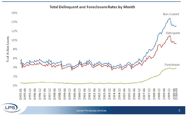
The average number of days delinquent for loans in foreclosure is now 484 days
• In five judicial states (NY, FL, NJ, HI and ME), the average exceeds 500 days
• Over 4.3 million loans are 90 days or more delinquent or in foreclosure
• New problem loans (60+ days delinquent) are back on the rise
---------------
According to LPS, 9.27 percent of mortgages are delinquent, and another 3.84 are in the foreclosure process for a total of 13.11 percent. 
It breaks down as:
• 2.64 million loans less than 90 days delinquent.
• 2.32 million loans 90+ days delinquent.
• 2.05 million loans in foreclosure process.
For a total of 7.02 million loans delinquent or in foreclosure.
===============
homeownership:
The homeownership rate was at 66.9%, the same level as in Q2. This is at about the level of early 1999.
Homeownership Rate
The homeownership rate increased in the '90s and early '00s because of changes in demographics and "innovations" in mortgage lending. The increase due to demographics (older population) will probably stick, so I've been expecting the rate to decline to around 66%, and probably not all the way back to 64% to 65%.
------------
The homeowner vacancy rate was at 2.5% in Q3 2010. This is the same level as in Q2, and below the of 2.9% in 2008.
Homeowner Vacancy Rate
A normal rate for recent years appears to be about 1.7%.
This leaves the homeowner vacancy rate about 0.8% above normal. This data is not perfect, but based on the approximately 75 million homeowner occupied homes, we can estimate that there are close to 600 thousand excess vacant homes.
--------------
The rental vacancy rate declined to 10.3% in Q3 2010 from 10.6% in Q2. 
Rental Vacancy Rate
This decline fits with the Reis apartment vacancy data and the NMHC apartment survey.
This report is nationwide and includes homes for rent.
It's hard to define a "normal" rental vacancy rate based on the historical series, but we can probably expect the rate to trend back towards 8%. According to the Census Bureau there are close to 41 million rental units in the U.S. If the rental vacancy rate declined from 10.3% to 8%, then 2.3% X 41 million units or about 950 thousand excess units would have to be absorbed. 
This suggests there are still about 1.55 million excess housing units. These excess units will keep pressure on housing starts, rents and house prices for some time.
=========
LPS: Over 4.3 million loans 90+ days or in foreclosure
http://www.calculatedriskblog.com/2010/11/lps-over-43-million-loans-90-days-or-in.html
------------
Q3 2010: Homeownership Rate at 1999 Levels
http://www.calculatedriskblog.com/2010/11/q3-2010-homeownership-rate-at-1999.html
==========

Wednesday, November 3, 2010

U.S. private-sector employment up 43,000: ADP

[mEDITate-OR:
think that everything looks the same...

Medium & Small businesses did hire.
Large businesses did not.

Services expanded - a lot.
employment in the service-providing sector rose by 77,000 in October, the ninth consecutive monthly gain.
Construction & Manufacturing contracted:
Construction employment has declined for over three years and the total decline in construction jobs since the peak in January 2007 is 2,313,000.
------------

---------

---------
According to the ADP Report:
employment in the service-providing sector rose by 77,000 in October, the ninth consecutive monthly gain.
This increase was enough to offset an employment decline in the goods-producing sector of 34,000.
Manufacturing employment declined 12,000 during October, the second consecutive monthly decline.
Large businesses, defined as those with 500 or more workers, saw employment decline 2,000
while employment among medium-size businesses, defined as those with between 50 and 499 workers, increased by 24,000.
Employment among small-size businesses, defined as those with fewer than 50 workers, increased by 21,000.
In October, construction employment dropped 23,000. Construction employment has declined for over three years and the total decline in construction jobs since the peak in January 2007 is 2,313,000.
Employment in the financial services sector dropped 2,000. Financial Services employment has declined for over 3 years.
==========
U.S. private-sector employment up 43,000: ADP
http://www.marketwatch.com/story/private-sector-jobs-rise-43000-in-october-adp-2010-11-03?reflink=MW_news_stmp
-------------
US private-sector employment increased by 43,000 in October
http://www.finfacts.ie/irishfinancenews/article_1020941.shtml
---------
ADP: Private Employment increases by 43,000 in October
http://www.calculatedriskblog.com/2010/11/adp-private-employment-increases-by.html
=========

MBA: Mortgage Purchase Applications Increase slightly last week

[mEDITate-OR:
or believe the headline is telling U.S. "The Truth"

Once again mixing date misleads U.S.
IF we look at unadjusted purchase numbers there was almost no change.
If we look at CRs moving averages, there was a decline.

Disirregardless, the drop from last year is still almost 30%
---------
The Refinance Index decreased 6.4 percent from the previous week.
The seasonally adjusted Purchase Index increased 1.4 percent from one week earlier.
The unadjusted Purchase Index increased 0.2 percent compared with the previous week
and was 28.0 percent lower than the same week one year ago

------------
MBA Purchase Index
==========
MBA: Mortgage Purchase Applications Increase slightly last week
http://www.calculatedriskblog.com/2010/11/mba-mortgage-purchase-applications.html
===========

In charts: House prices, U.S. GDP and more Weekly graphical summary of the key economic reports

[mEDITate-OR:
not watch the Marketwatch graphs show U.S. "things"...
Each week they provide U.S. with another set of charts.
Unique, no; good, yes.
---------
New Home Sales:
Data released this week showed an increase in house market activity in September, with new-home sales (seen above) and existing-home sales both increasing. Both indicators, however, are at historically depressed levels. So while a floor may have been reached after the expiration of the first-time homebuyer’s tax credit, there’s still ample room to grow.
San Francisco, up 7.8%; San Diego, up 6.9%; Los Angeles, up 5.4%; Washington, up 4.8%; Minneapolis, up 2.9%; Boston, up 1.5%; Phoenix, up 0.4%; New York, up 0.1%;
Detroit, down 0.1%; Cleveland, down 0.4%; Miami, down 1.0%; Denver, down 1.2%; Dallas, down 1.7%; Atlanta, down 2.0%; Portland, down 2.3%; Seattle, down 2.4%; Chicago, down 2.9%; Charlotte, down 3.4%; Tampa, down 4.1%; and Las Vegas, down 4.5%.
--------------
The most closely followed house price index, the S&P/Case-Shiller index, slipped 0.2% in August. The details were disturbing — 15 of the 20 metropolitan areas declined. There were several indexes released over the week, from those embedded in the existing- and new-home sales reports to one based on mortgages bought or guaranteed by Fannie Mae or Freddie Mac. While not universally negative, the gauges broadly showed a softening in prices.
------------
Weekly initial jobless claims dropped to 434,000, the third straight drop and the lowest level since early July. Most economists believe the indicator needs to fall to around the 400,000 level to signify an upswing in hiring.
-------------
The U.S. economy grew at a 2% annualized clip in the third quarter, slightly faster than the 1.7% rate during the second quarter but not enough to actually get companies hiring again. Consumer spending returned, but business spending growth slowed. The figures aren’t likely to deter the Federal Reserve from announcing a second round of quantitative easing on Wednesday.
=========
In charts: House prices, U.S. GDP and more
Weekly graphical summary of the key economic reports
http://www.marketwatch.com/story/in-charts-house-prices-us-gdp-and-more-2010-10-29
----------
U.S. home prices drop 0.2% in August - Report is ‘disappointing,’
http://www.marketwatch.com/story/us-home-prices-fall-02-in-august-case-shiller-2010-10-26
-------
Jobless claims drop 21,000 to 434,000
Continuing claims down 122,000 at 4.36 million
http://www.marketwatch.com/story/weekly-jobless-claims-fall-21000-to-434000-2010-10-28-844130
-------
GDP rises 2% in third quarter on consumer spending
Spending growth of 2.6% is fastest since fourth quarter of 2006
http://www.marketwatch.com/story/q3-gdp-up-2-on-consumer-spending-2010-10-29
==========

Sunday, October 31, 2010

Double Dip Delayed, Not Derailed; Understanding Consumer Spending

[mEDITate-OR:
miss out on Mish Shedlock's stunningly informative graphs...
and
a very unusual and accurate explanation of what "consumer spending" is, and is not.

In Mish's 1st chart he shows U.S. how stunningly weak this so-called "recover" really is.
Not only is it FAR below the average at this stage, it is the weakest of all prior recoveries.

In his contribution chart on the right, what Mish does not mention is that "personal" consumption is skewed UP by the inclusion and increases in Medicare & Medicaid spending. IF we back out that, personal consumption went down, not up.

THAT explains, and is shown to U.S., in Mish's 2nd chart.
While what we said that we were spending started to go up from Jan 2 July, it then collapsed to even less than last year.
Please, note, that when spending started down in May 08 that was the beginning of the RE and jobs collapse Far Right before the election.

Mish's 3rd chart is absolutely stunning.
First note the correlation with the consumer spending decline noted above in the 3rd Q of 08 !!
Second, note that "unemployment" does not even begin to explain the extreme fall off of income tax receipts !
Third, note that the spurt in sales tax receipts after the 3rd Q of 09 is directly tied to the beginning of sale tax increases passed by state legislatures, trying to stem the bleeding.
Fourth, note that in the charts last Q income tax receipts are now going back down.

Mish's table, 4th below explains some of the shifts.
While person income taxes were recovering, now they are not, as much.
More to the point, business income taxes dropped earlier and from Q2 of 07 by more than PIT or sales taxes. And, plunged in the tables last Qr.
So, that while the sales tax increases WOULD have stopped the bleeding, the collapse of PIT and CIT have more than offset that.

Ouch.
--------------

----------
----------
---------

=============
Double Dip Delayed, Not Derailed; Understanding Consumer Spending
http://seekingalpha.com/article/233363-double-dip-delayed-not-derailed-understanding-consumer-spending?source=email_the_macro_view
-------------------
Retail Sales Rise More Than Forecast; Once Again I Ask "Really?"
http://globaleconomicanalysis.blogspot.com/2010/10/retail-sales-rise-more-than-forecast.html
-----------------
Retail Sales Rise .4% from July - How Far to Pre-recession Levels? Where to from Here?
http://globaleconomicanalysis.blogspot.com/2010/09/retail-sales-rise-4-from-july-how-far.html
===========